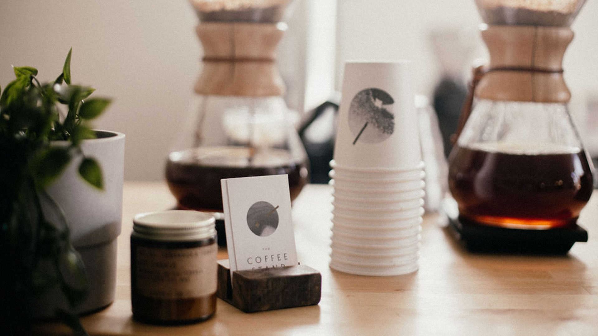
The Coffee Stand
Brand Identity
-
Year: 2019
Dan Gillis is a coffee aficionado and a former bartender who wanted to share his love for the art of coffee by taking his own spin on the mobile coffee stand. He merged his skillsets to create a unique offering - handcrafted coffee cocktails.
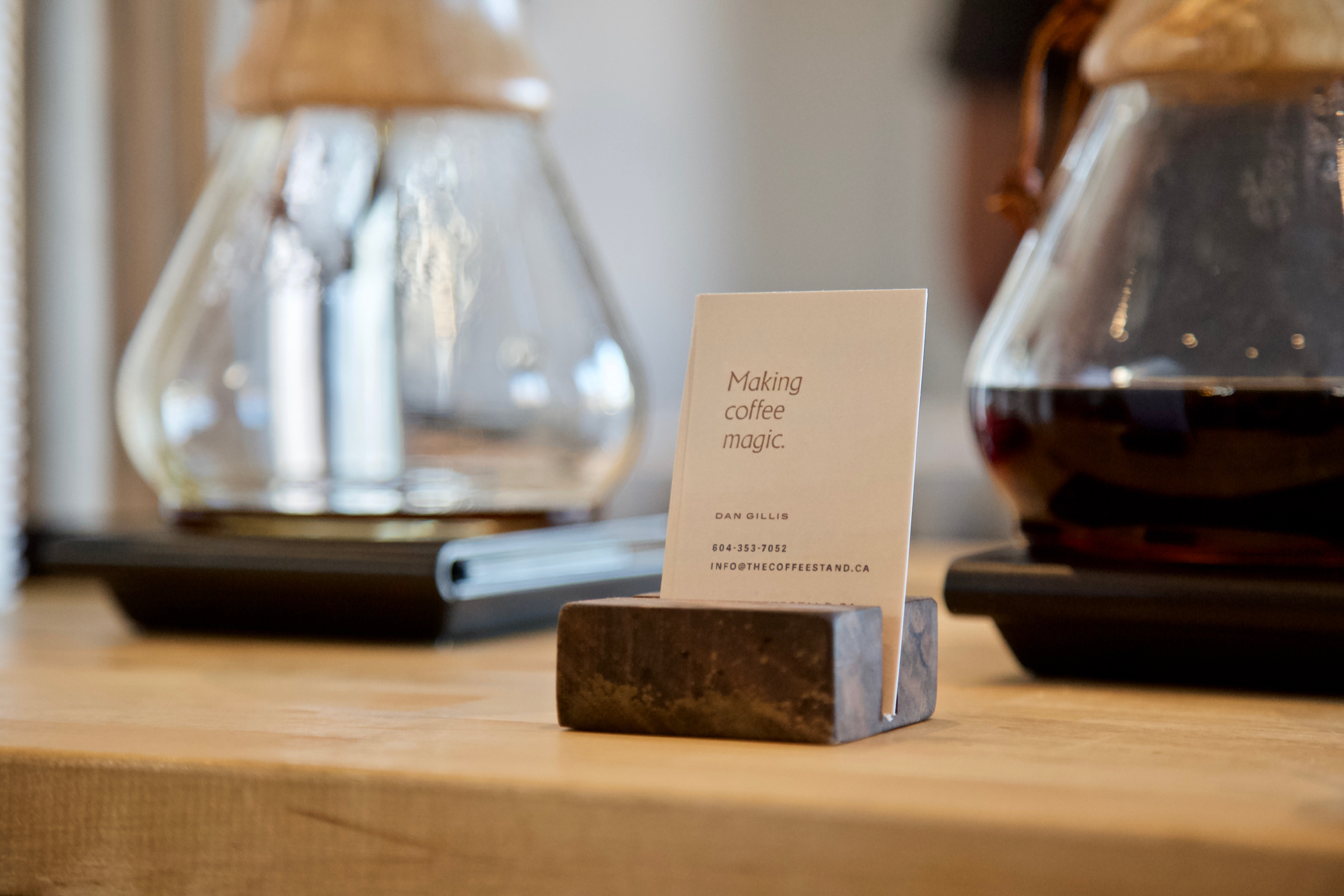
These aren’t your average coffee pourovers, he’s making coffee magic.
These aren’t your average coffee pourovers, he’s making coffee magic.
In talking with Dan, we realized that the brand needed to feel as at-home at an elegant outdoor wedding as it would at, say, a street festival where steezy skateboarders and coffee snobs might hang out.


We decided on a brand direction that reflected the high quality and craft of Dan’s drinks, the surprise and delight of a coffee cocktail, as well as the charismatic experience of his service. Elegance and edge informed all our decisions.
We started with the idea that what The Coffee Stand was offering was unique - he was taking quality coffee and creating something you wouldn’t expect, and the results were kind of magical - and a brand was born!
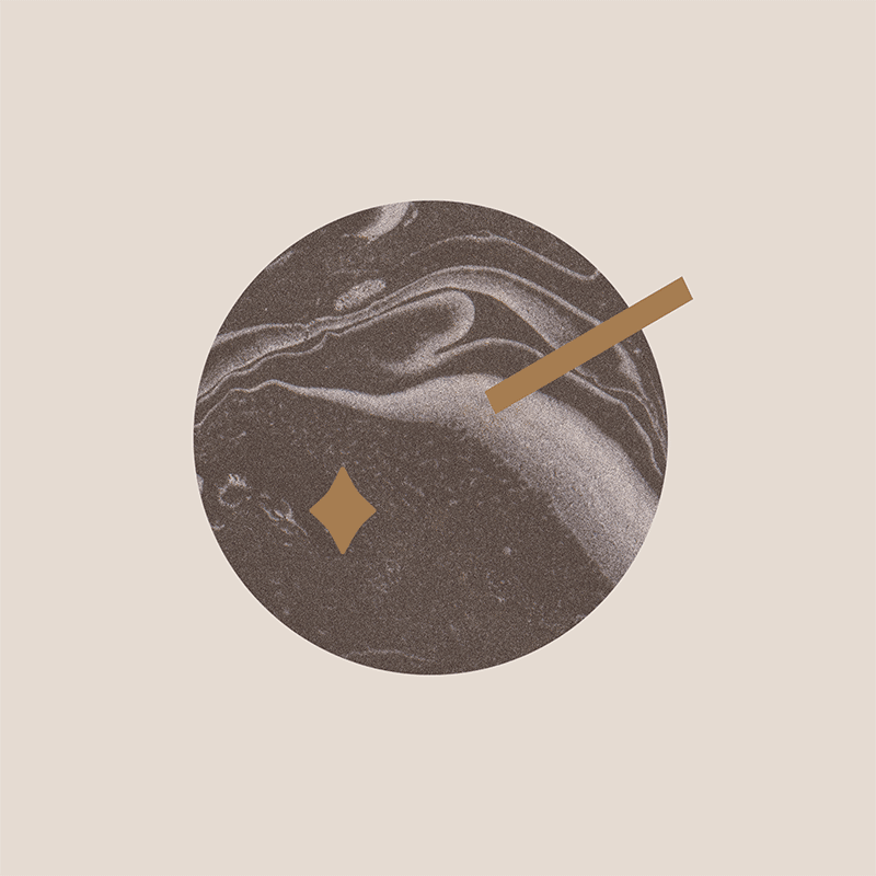
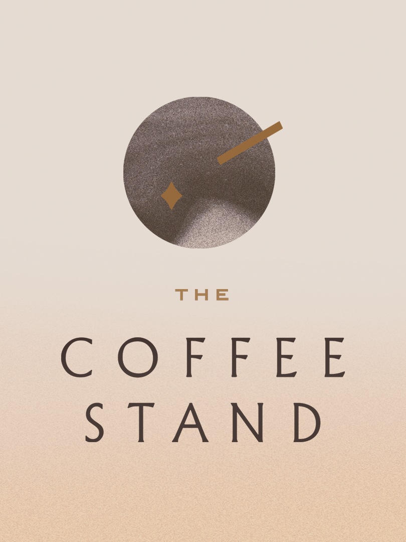
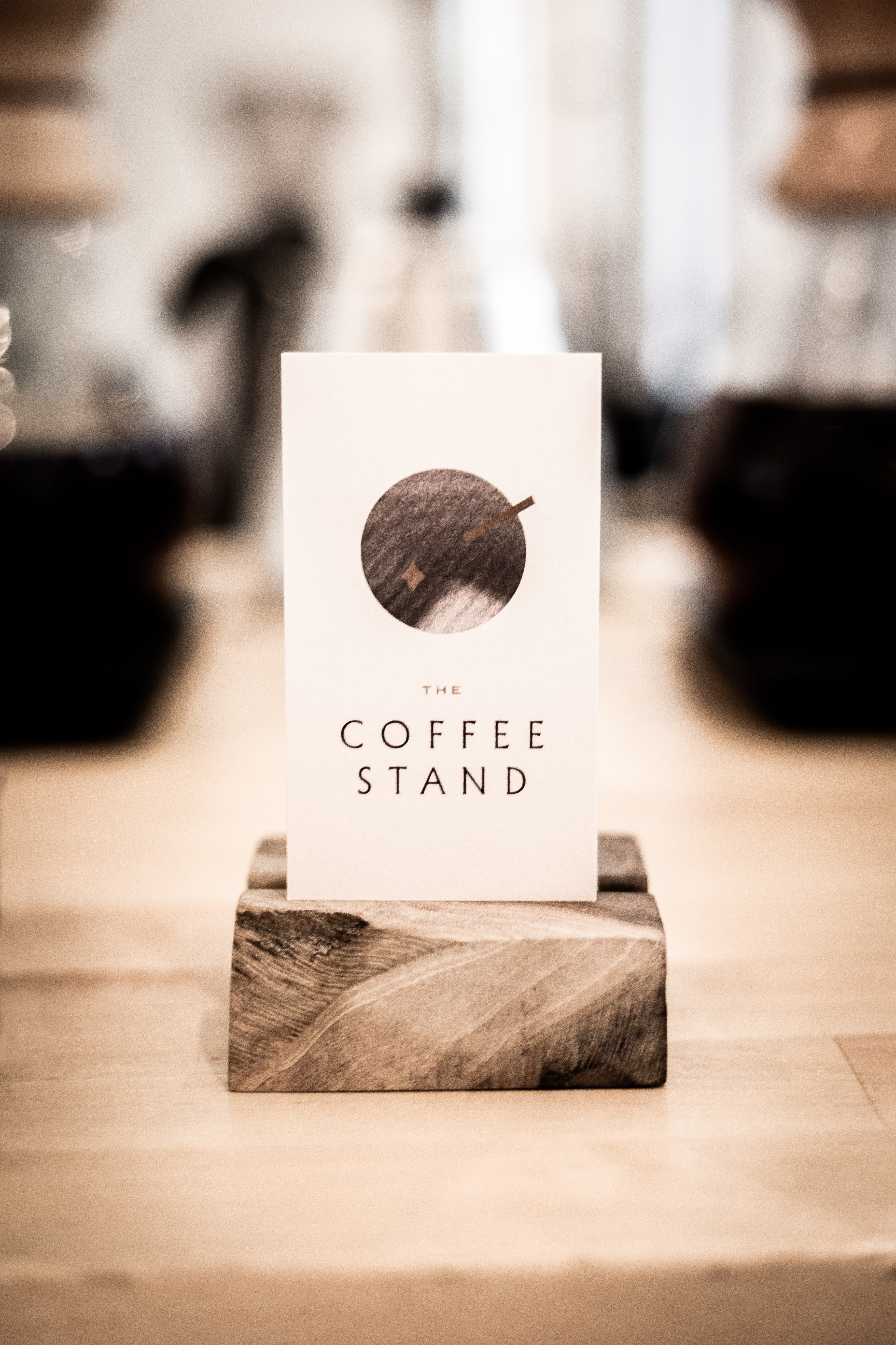
We settled on the tagline “Making Coffee Magic” and developed the brand from there. The logo needed to bold enough to stand out on the side of a coffee cup, but be subtle enough that it wouldn’t steal the show at a formal event.
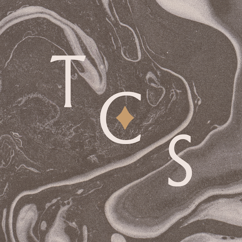
The logomark is a bird’s eye view of a cocktail with a straw and a garnish. But from another perspective it’s a wand and a spark of coffee magic. A variable marbled foam texture allows the logo to shift depending on the application, and the grain texture provides a bit of grit.
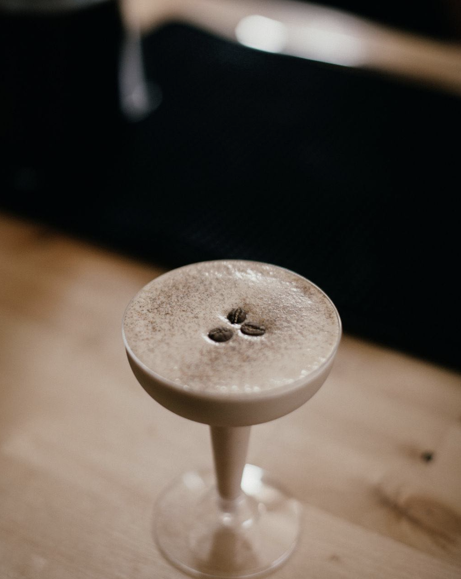
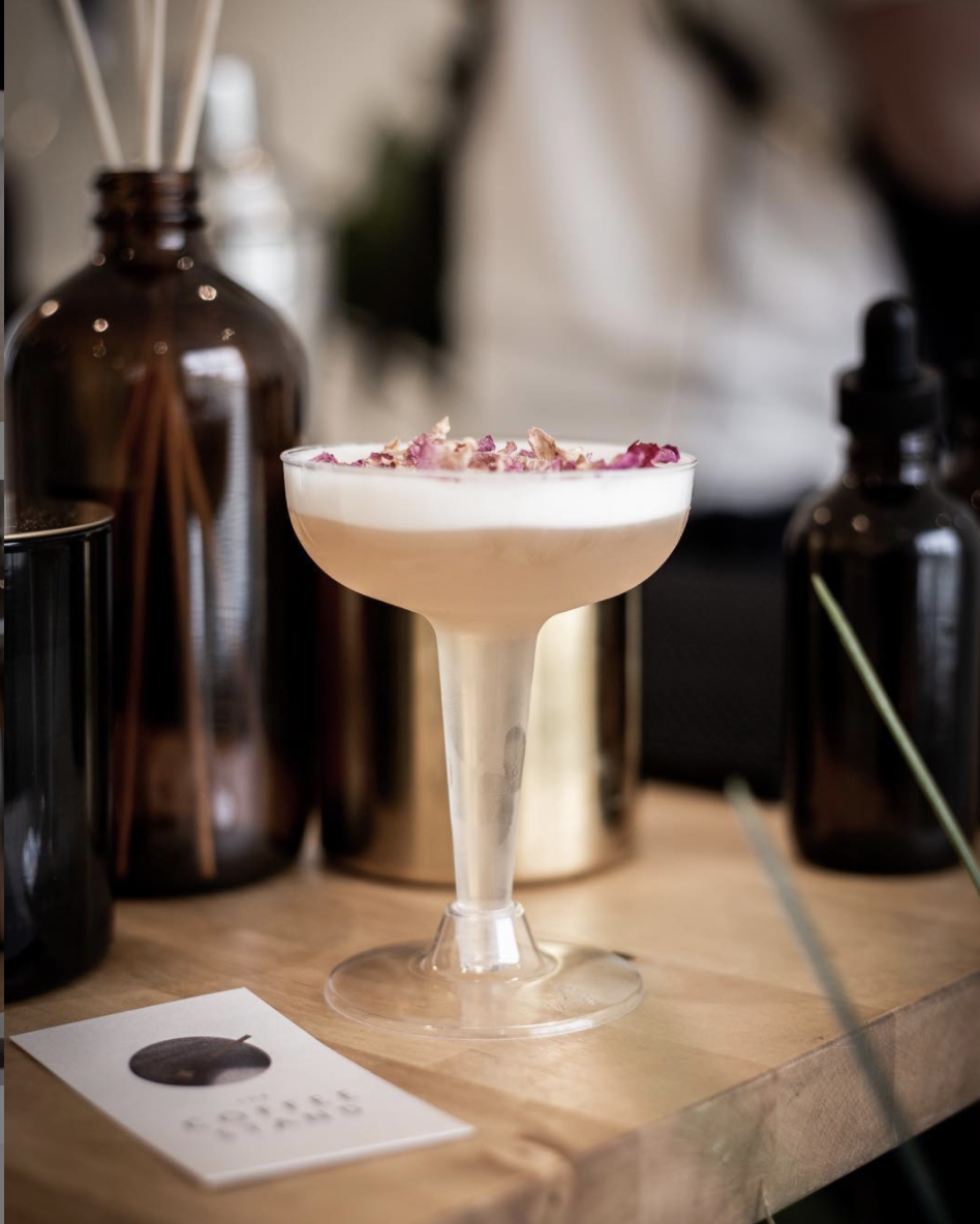
The brand’s colours reflect the cocktails themselves - foamy beiges, warm oranges, rich coffee brown, and gold for a touch of refinement.
The brand’s typefaces both fit the brief - depending on the application they can have edge or be elegant (or both). The counter of the O is reminiscent of a coffee bean, and its sturdiness helps balance the logomark, keeping it from feeling too whimsical.