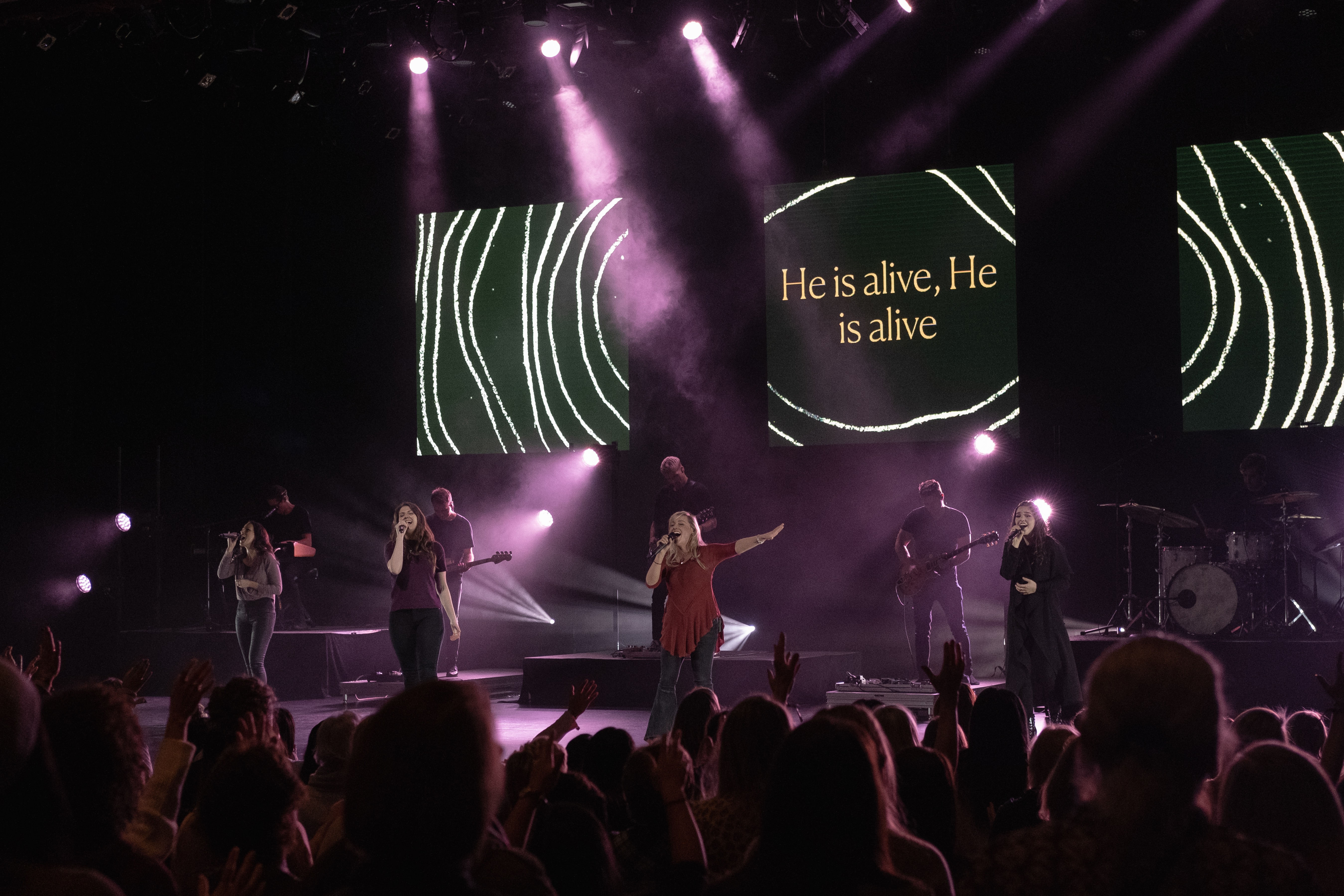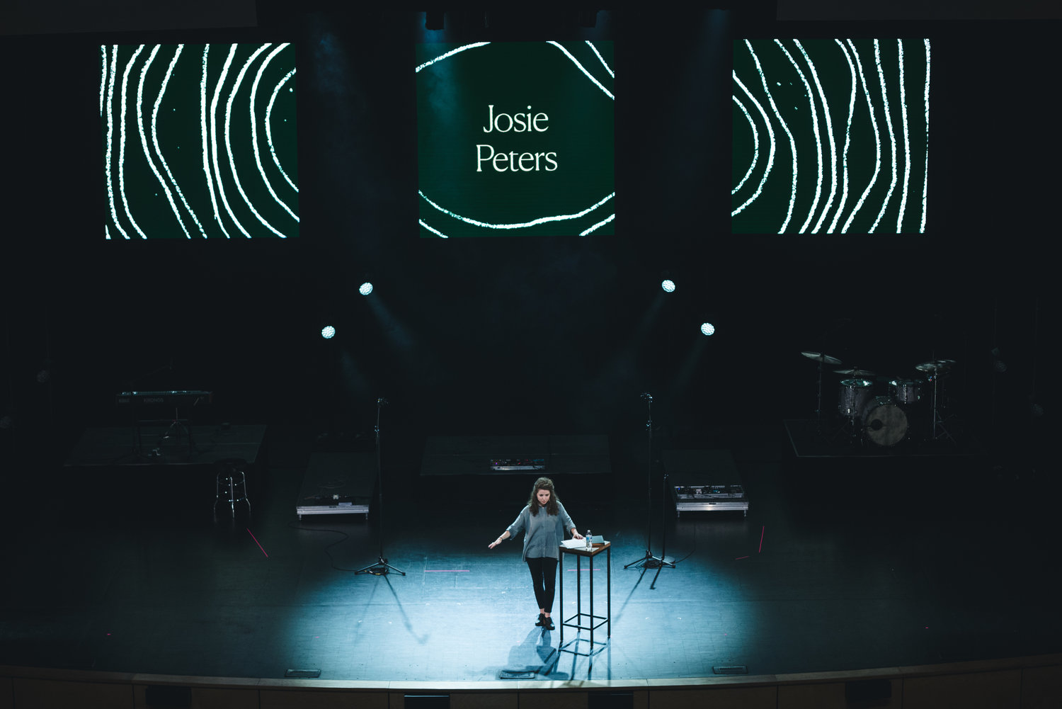
Amplify Women’s Conference
Art Direction, Brand Design, Print Design, Stage Design.
-
Year: 2018
What is love? It’s a question as old as time itself. Village Church’s women’s ministry wanted to host a conference centering around the theme of love - how it changes us for the better, and how that change compels and empowers us to live differently in the world.


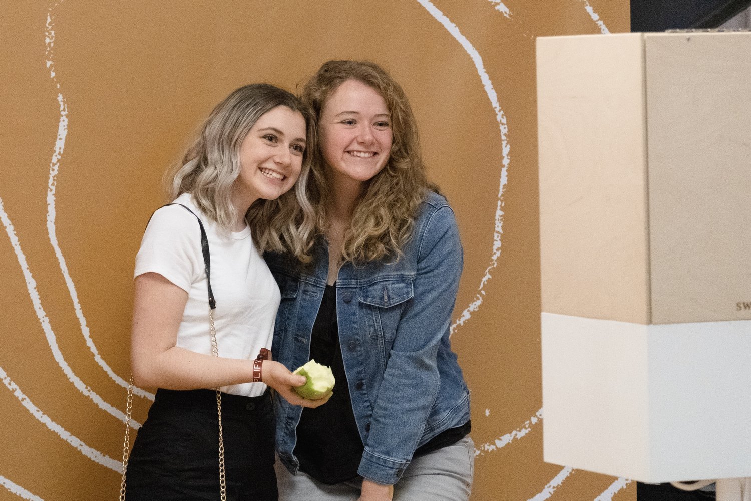
This project was an exercise in process. I was given the name “Amplify” and then collaborated with the event’s team to develop branding, visuals, messaging, and many branded applications for the event - from admission bracelets, to nametags, to merch.
The challenge of this branding project was the many themes it needed to include. It was important for the brand to communicate the idea of amplification - our actions and their potential for positive change in the world - but it was equally as important for the visuals to be joyful, interesting, and trend-forward. We wanted to show comraderie - the idea that loving our neighbours and being in community with one another was central to amplifying love into the world. Conceptually, we had a lot of ground to cover.
We decided on an editorial, photography-driven direction. It was different from what our audience was used to in the context of what the organization usually did graphically, and felt elevated from similar events that had been held in the past. It was also an opportunity to put a spotlight on women in the church’s community who weren’t usually seen or heard from - we centred them and their stories as a way of allowing our audience to connect more personally with the content.

I pulled colours and type inspiration from popular fashion designers and colour trends that summer. The concentric textured ripples acted as a way to tie branded elements together across print, stage visuals, motion graphics and social media, while being the main graphic element communicating the central idea of amplification.


