AhHa
Brand Development, Logo & Brand Identity Design-
Agency: Good Fortune Collective
Year: 2023
When we were approached to help craft a brand around an ethos of solving common problems in cycling while being committed to the wellbeing of people and the planet, we couldn’t have been more stoked. With a spirit of empathy and irreverent wit at its core, AhHa was born.
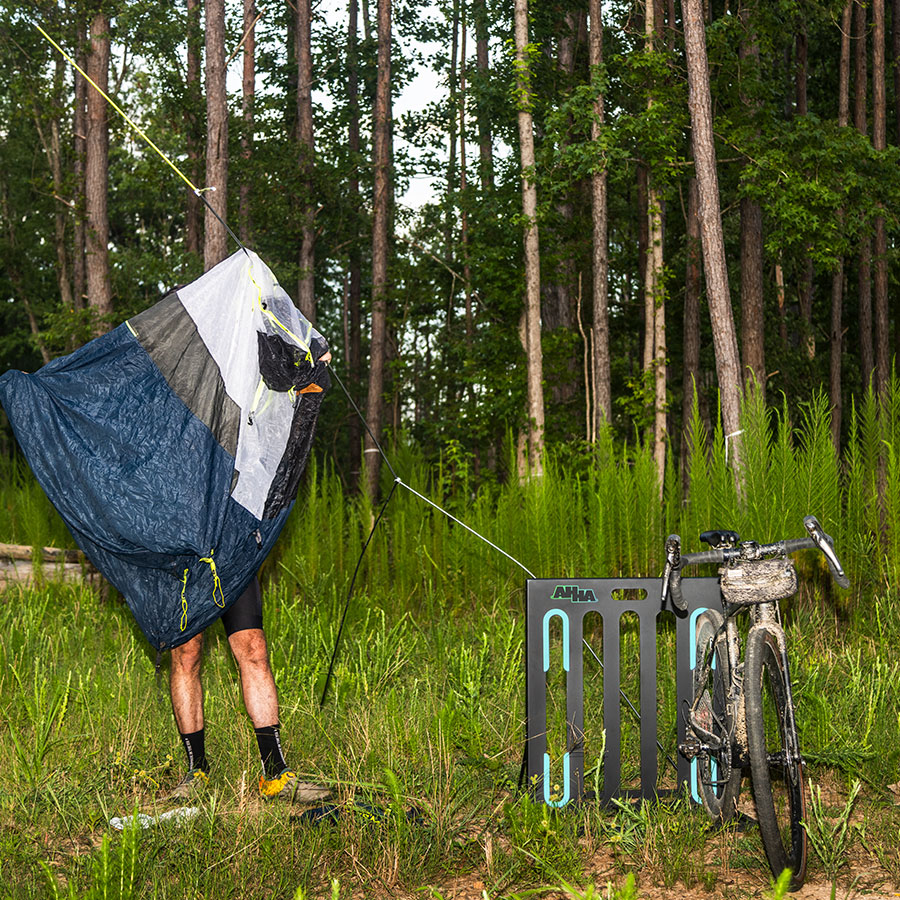
Built around the business’ flagship product, a fully recyclable folding bike rack we named the Toaster, we knew the brand needed to feel practical and technologically trustworthy while still being fun and unpretentious.
The name, AhHa, was inspired by a sudden moment of inspiration - the kind of exclamation you’d playfully shout when visited by a stroke of genius, or when something just clicks. The wordmark needed to function on-product and look at home in the back of a truck, at a race, or out on a rip with friends. As a bonus? It’s a palindrome. You can read it any way you like.


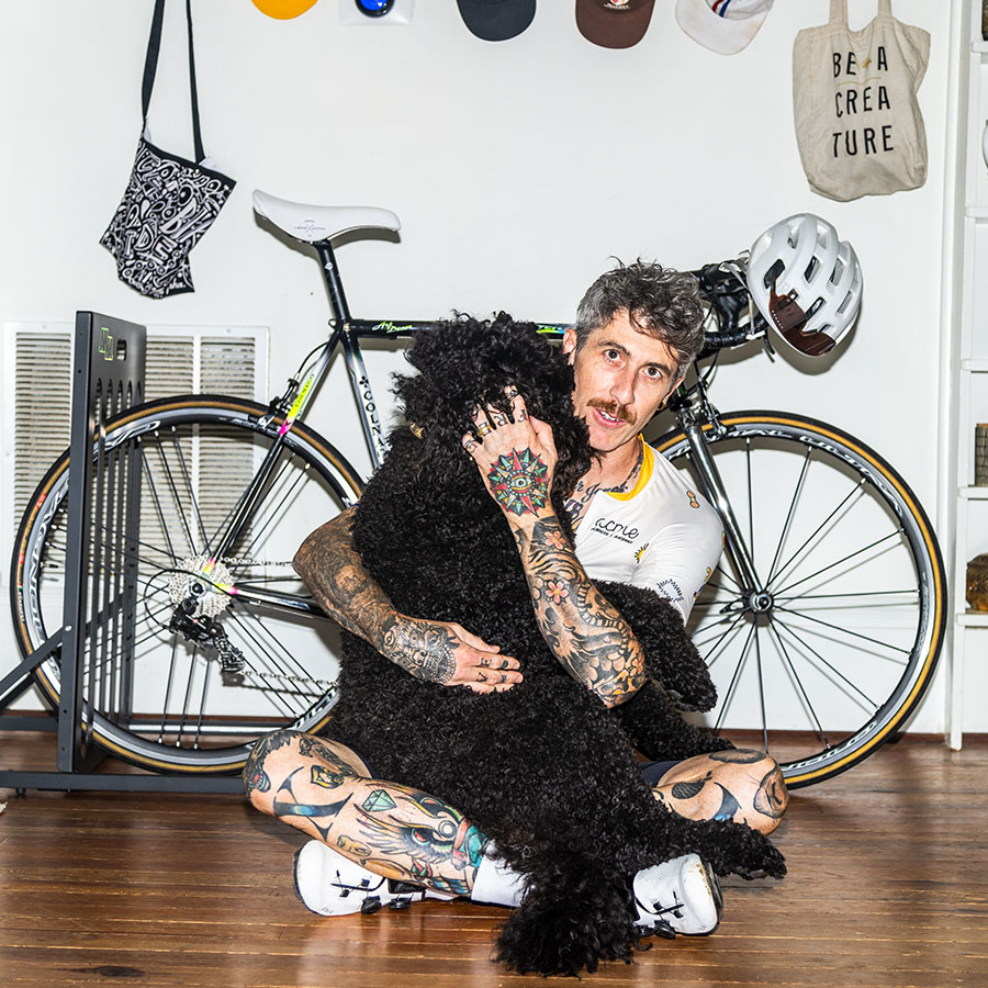
Direct-flash photography highlights the in-between human moments, the ones we don’t usually celebrate, that make cycling joyful.
For a seemingly minimalist product, we took a maximalist approach to colour. Why? A palette brimming with bold, bright, vibrant hues helps AhHa reject seriousness and embrace fun.
For a seemingly minimalist product, we took a maximalist approach to colour. Why? A palette brimming with bold, bright, vibrant hues helps AhHa reject seriousness and embrace fun.
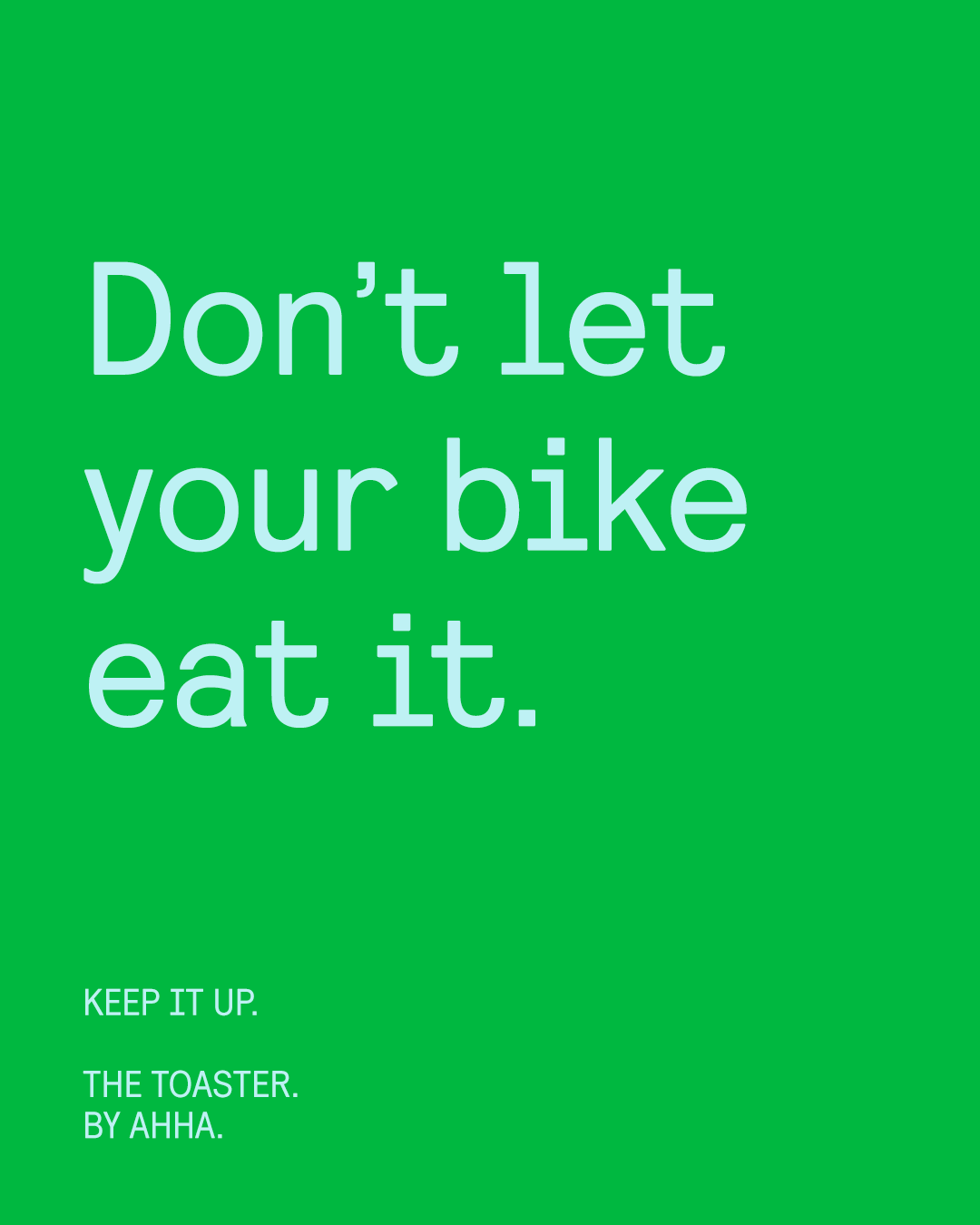
This is a “say what you mean, do what you say” vibe. Cheeky copy brings the personality, and sleek type holds it down.